"butterShug" Magazine Project
"butterShug" is an academic project from a course in Typography and Layout. The assignment required me to invent a fictional magazine, define its scope and audience, and give it a name.  I decided to create and design a magazine for those interested in photography. I named it butterShug, the word shutterbug with the s and b reversed. I designed a logo, three covers, and a layout.
butterShug Logo and Tagline
Typography: Gwyner
Logo for butterShug in colors of black, white, and red.  The letters are lowercase with the exception of the S. There is a red line drawing of a camera. Beneath the logo is the tagline "For the Modern Photographic Artist."
Covers
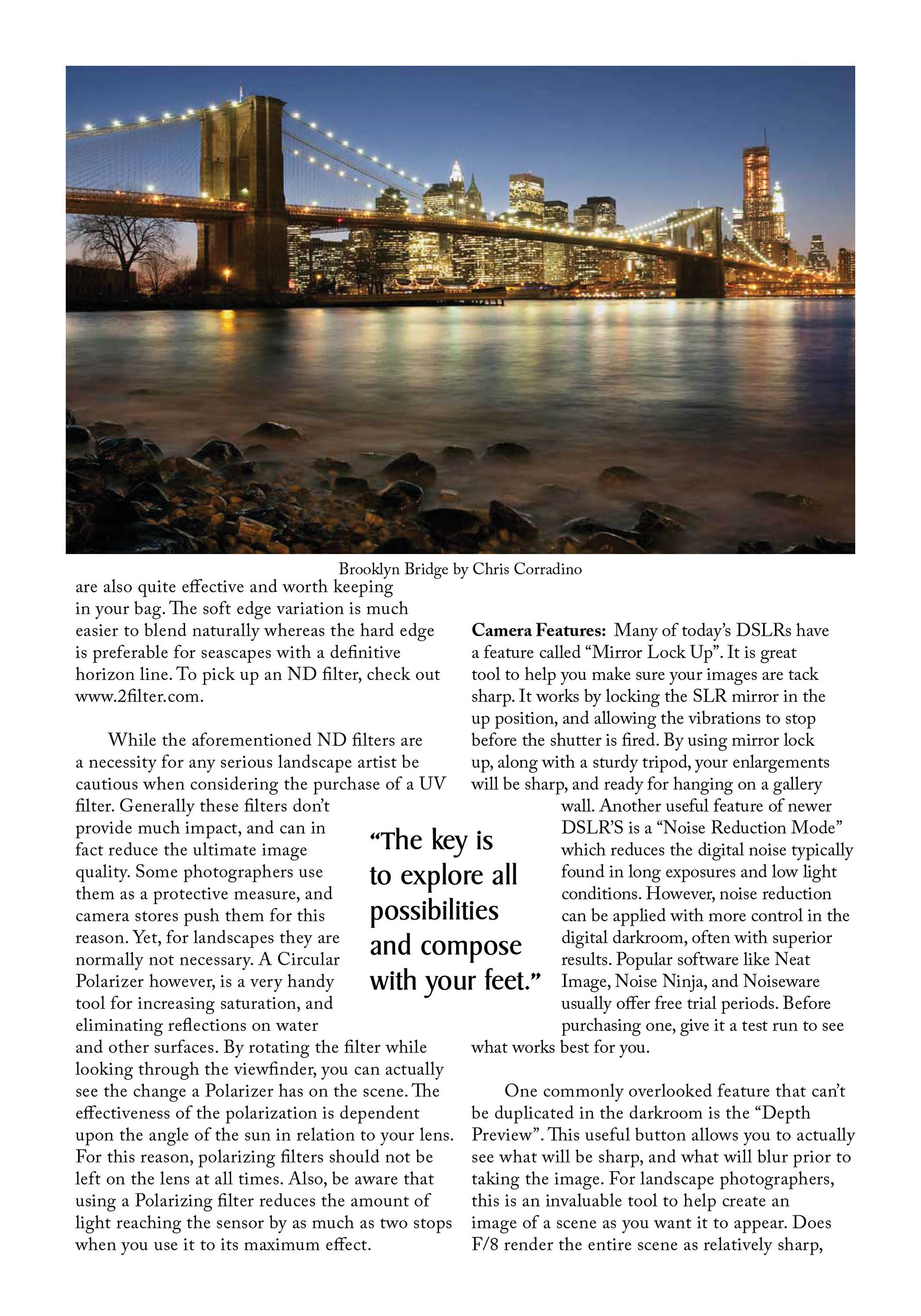
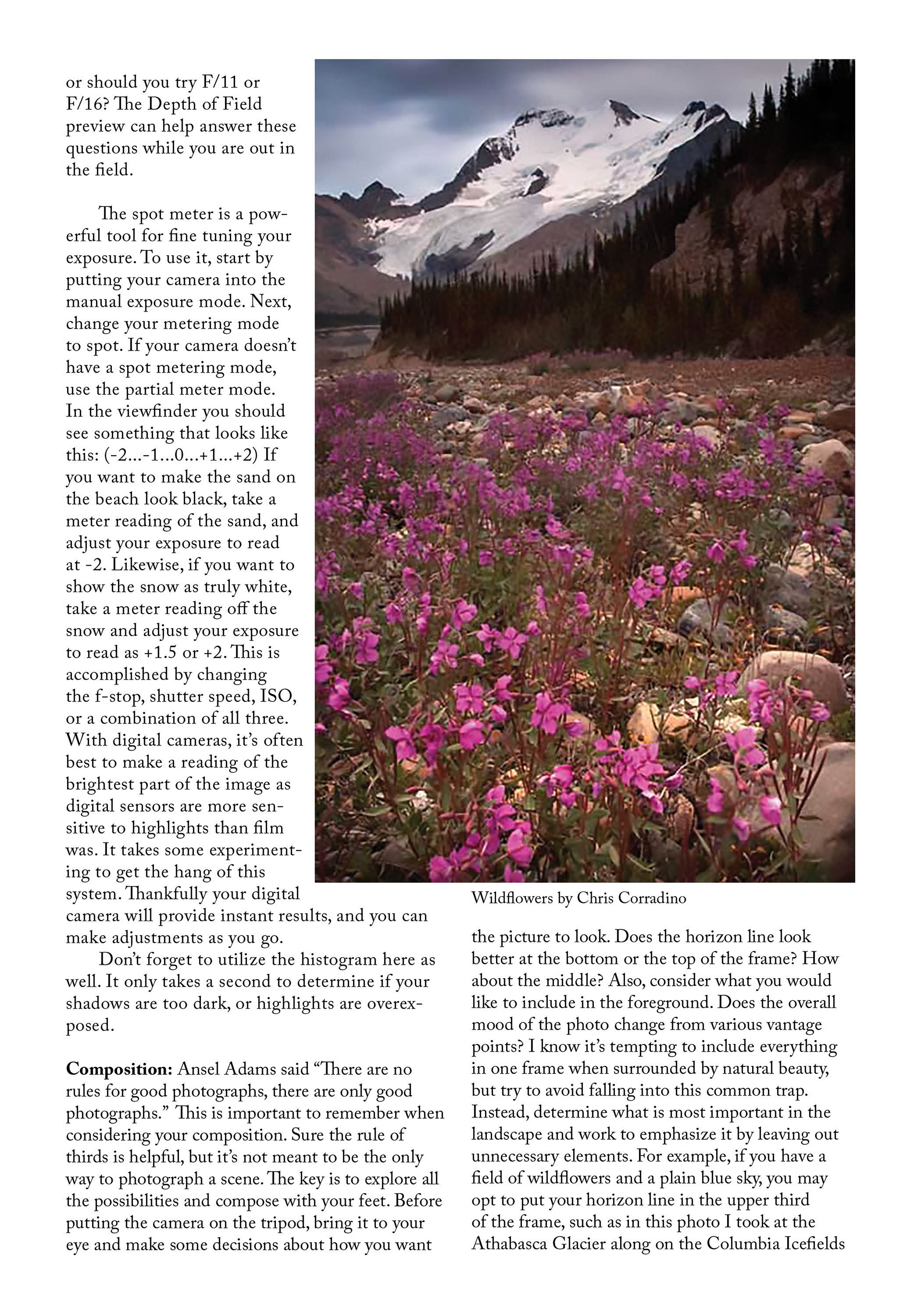
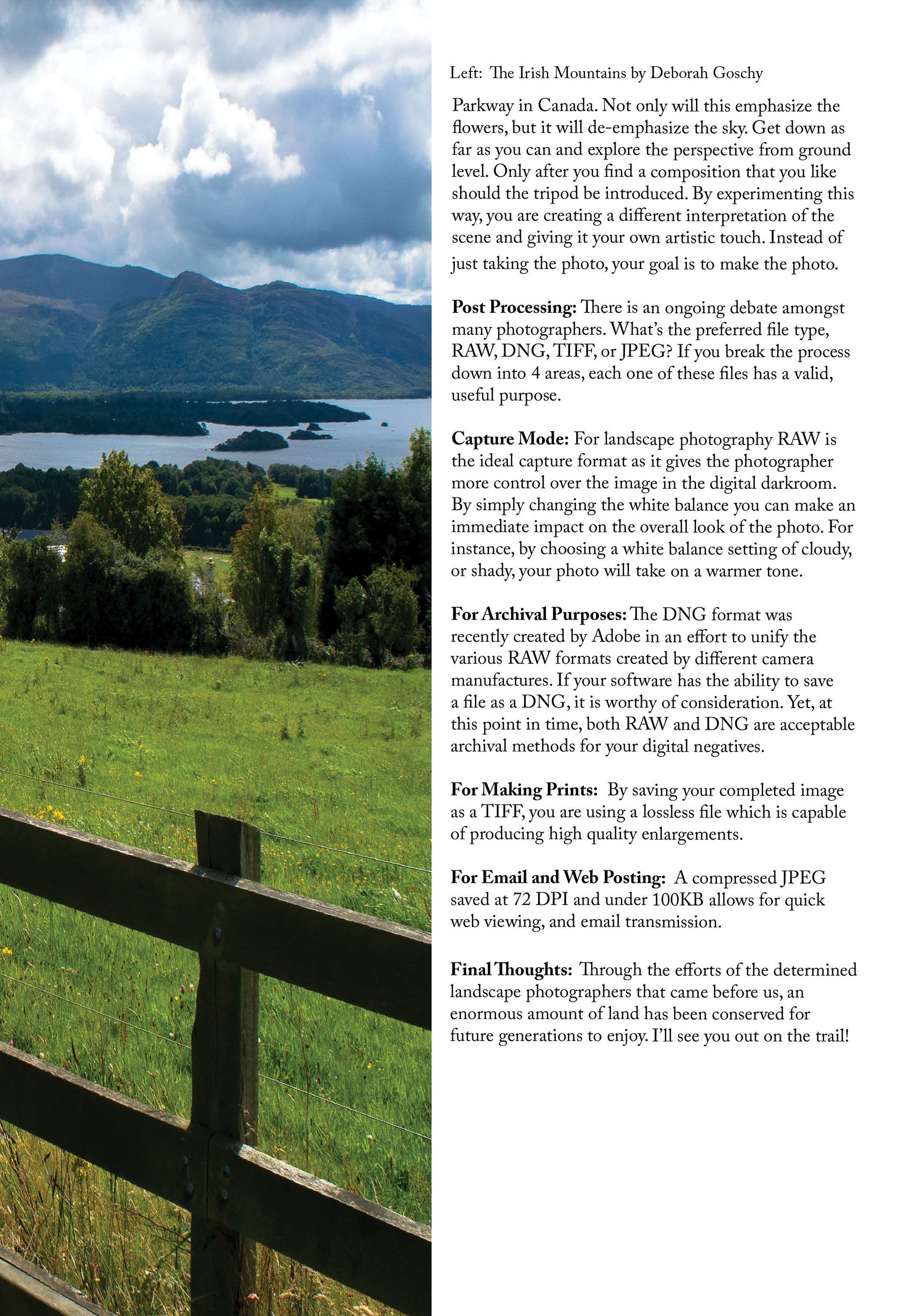
In the spirit of my fictitious photo magazine, I used my original photographic works as the basis for the cover images.  I assembled all elements of the covers--the image, logo, and type--in InDesign.
This cover has a photo of the bridge over the Liffey River in Dublin, Ireland.

This cover image is a composite of two photos: a photo of fire and a photo of a broken window in an abandoned ruin.
A black and white photo of a teen girl in a kitty cat covering her face with her hands is the image for this cover.
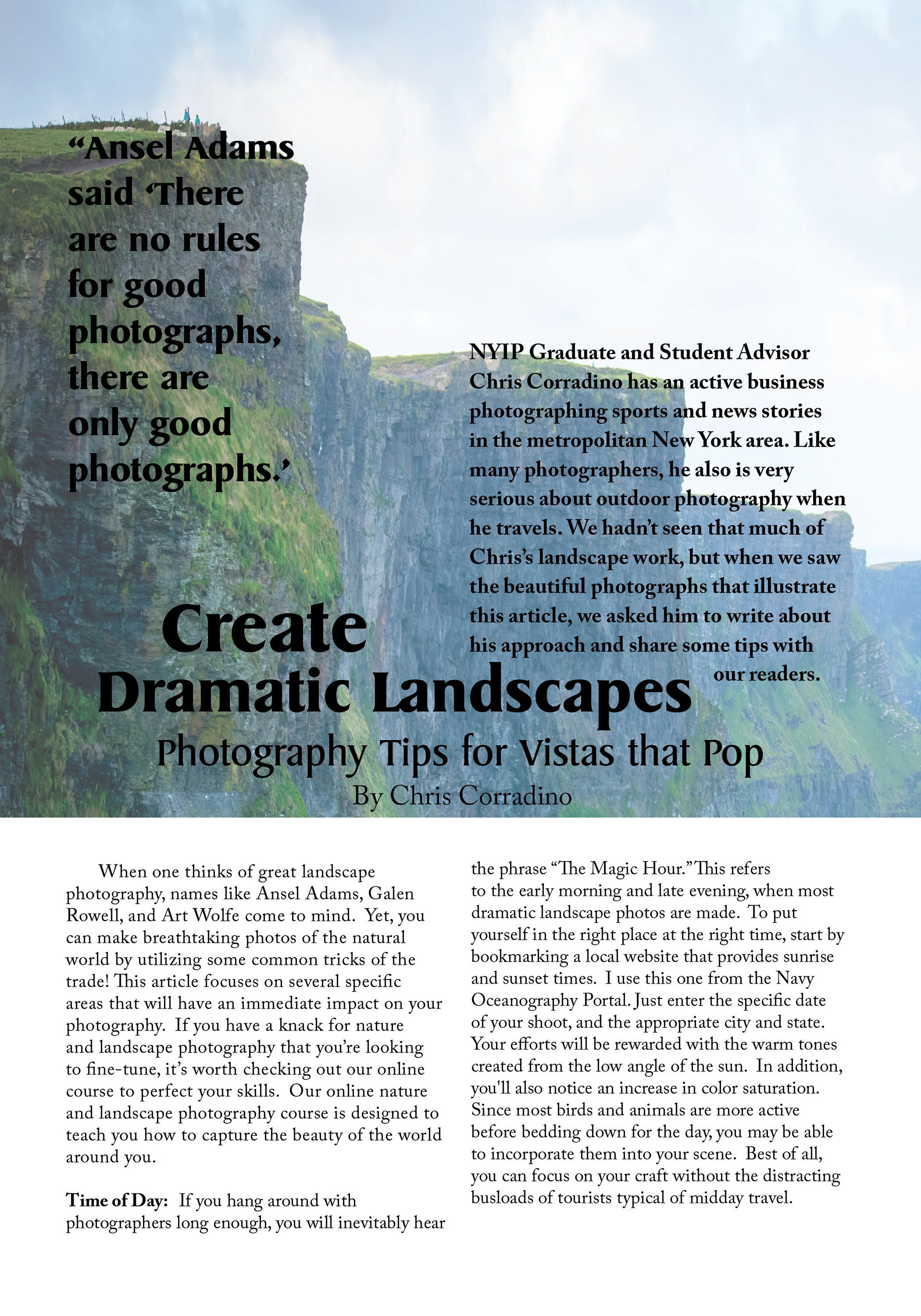
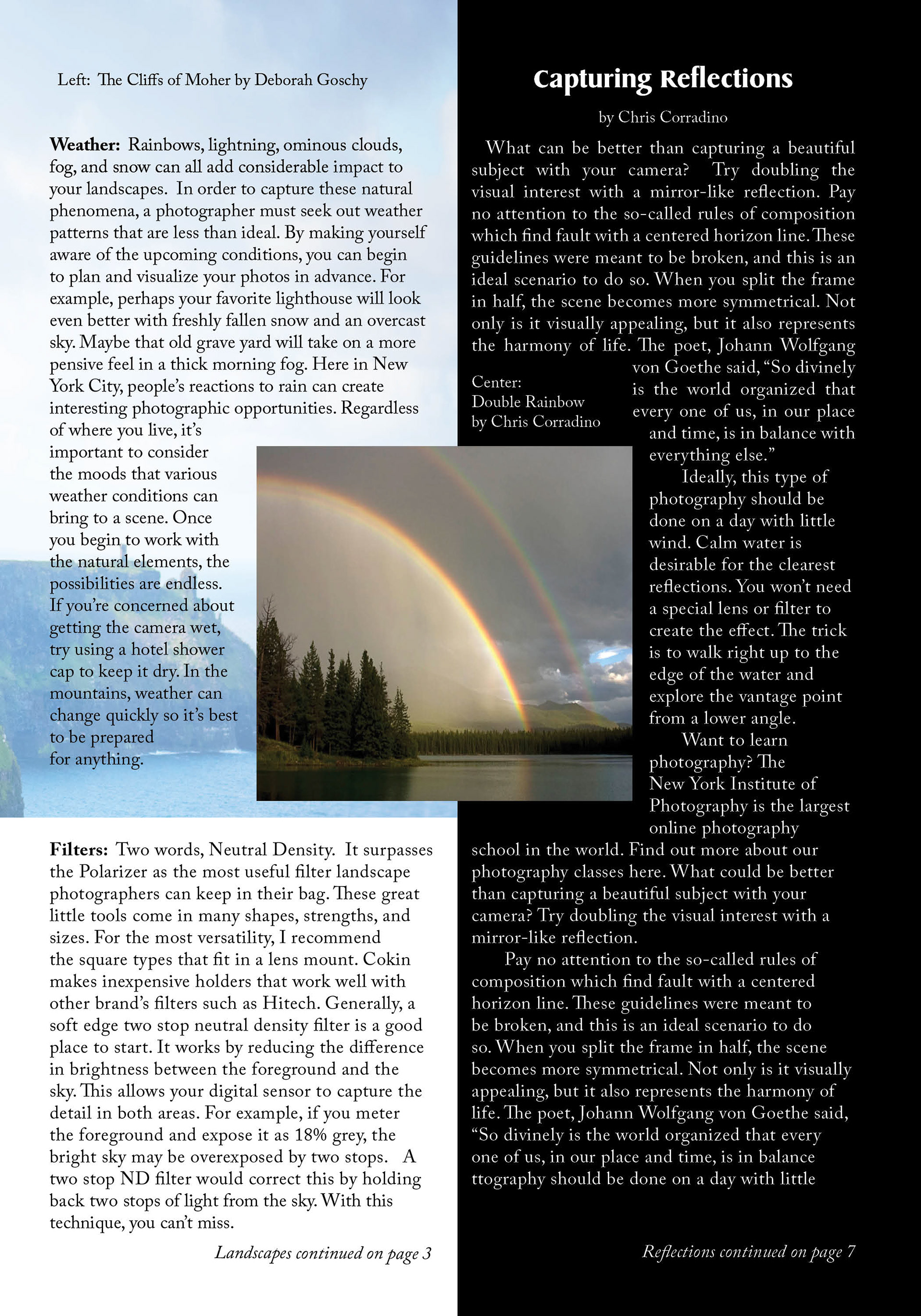
  The Layout
Back to Top